Project
overview &
progression
Project Proposal Notes –
Café Dom Luís
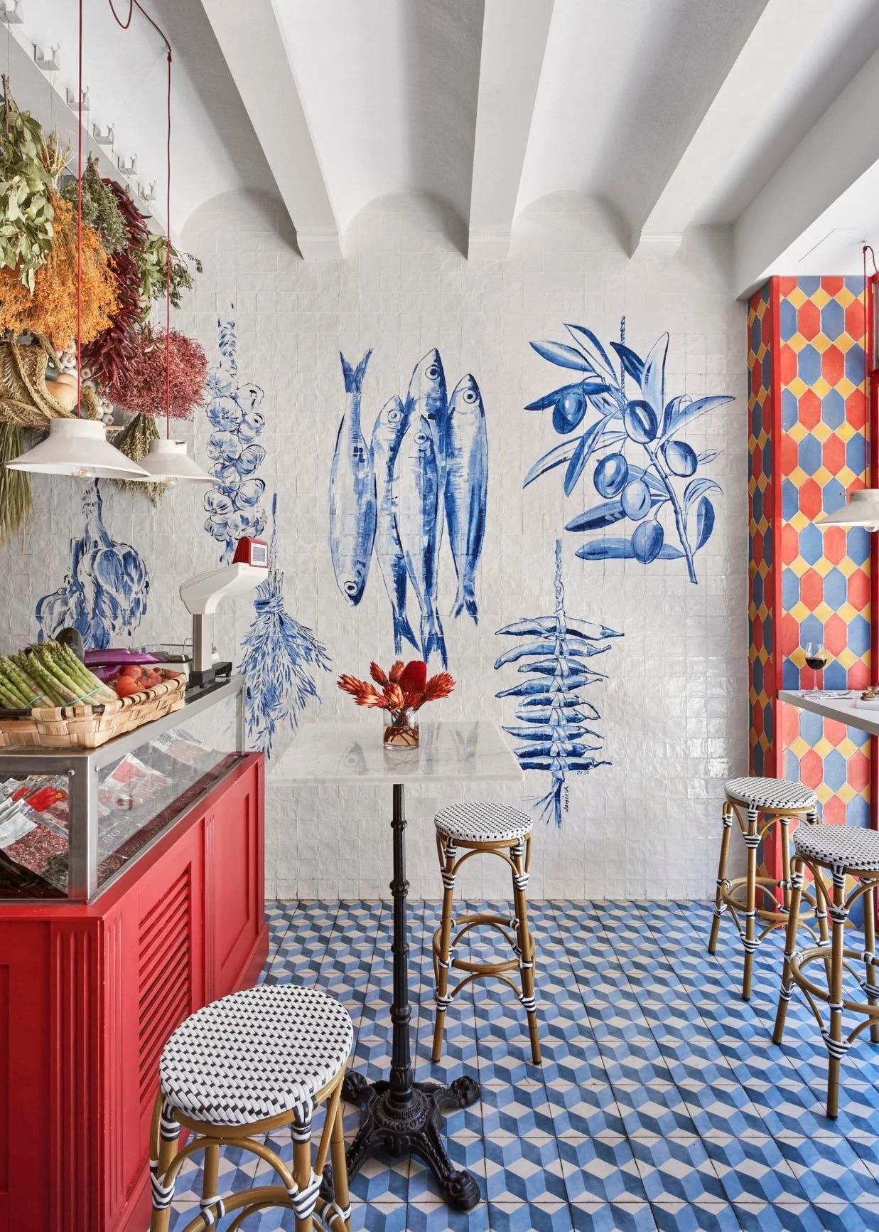
I travelled to Lisbon to experience the culture and atmosphere for myself. The city felt relaxed but full of life, traditional yet creative. The café culture really stood out to me. Each place had its own personality but still felt warm, authentic and rooted in everyday life. I loved how they balanced history with subtle modern design. That mix is something I want to bring into my project.
Concept Development
The idea for Café Dom Luís came from that trip. During a power cut across Spain and Portugal, my flight home was cancelled and I ended up stranded for three extra days. With no phone signal or Wi-Fi, I spent hours sitting in Jardim Dom Luís, just watching people and the pace of the city. It made me slow down and notice things properly. That experience became the foundation of the brand. Café Dom Luís represents calm, creativity and connection – all the things I noticed in Lisbon.
Aims and Focus
I want to create a café brand that celebrates Portuguese culture through design, storytelling and food. The look and feel should combine traditional influences with a clean, modern style. The focus is on authenticity, craftsmanship and slow living. I’ll use warm colours, simple illustrations and tactile materials to reflect that. Café Dom Luís will link personal experience with a wider cultural narrative.
Collected imagery
LOGO DESIGN
Design Notes
In my logo design, I included the Great Bustard to represent Portugal’s natural heritage. The bird, native to the Alentejo region, reflects the country’s landscape and biodiversity, giving the brand a deeper connection to place. I developed a simplified, more abstract version to use as a brandmark, clean, minimal, and able to stand alone while fitting seamlessly with the full logo. The red colour highlights the bird’s coppery feathers, flat beak, and bushy tail.
The Gerbera Daisy in Portugal is the symbol of love, beauty, innocence, and positive emotions.
Garden flower garland to represent the ‘jardim’ within the name of the cafe.
I based my logo on an archway, a shape commonly found in Portuguese architecture, particularly in the many windows and doorways that feature this elegant form.
Book & Research
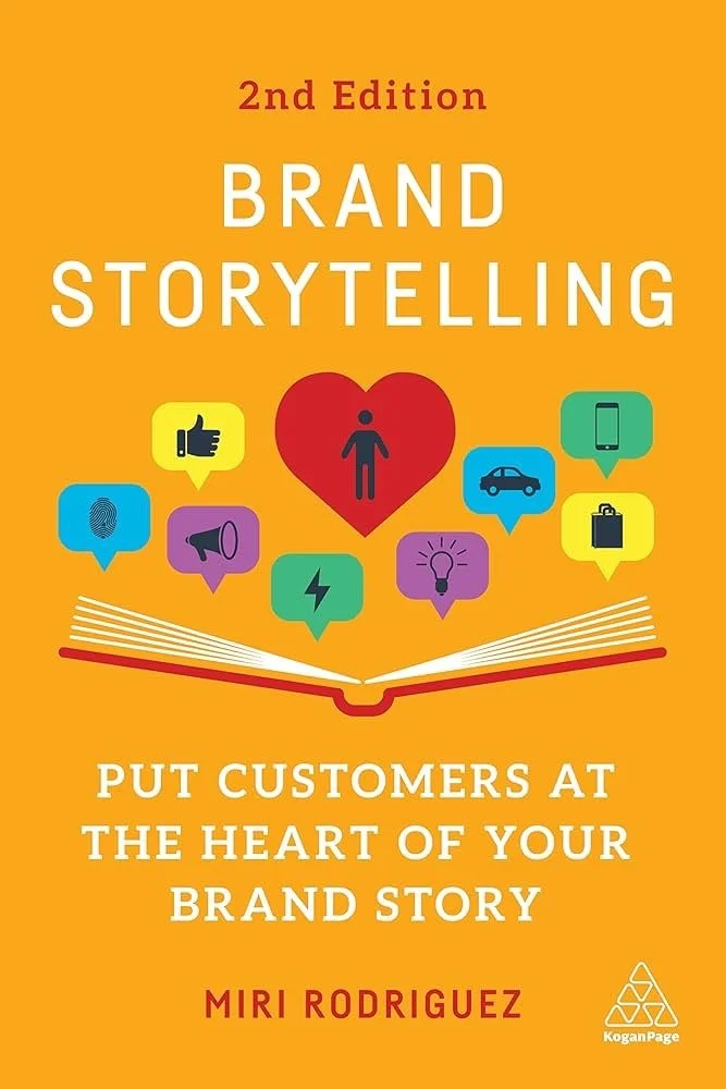
Brand Storytelling
Miri Rodriguez’s
user centred graphic design
Jorge Frascara
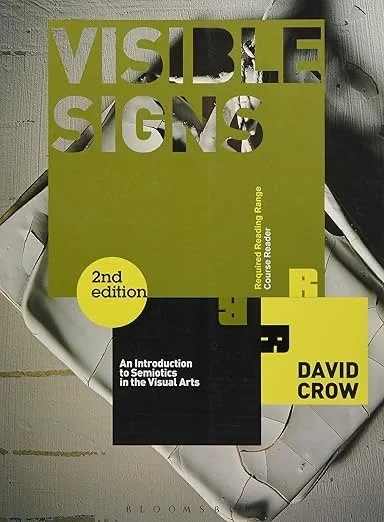
Visible Signs: An Introduction to Semiotics in the Visual Arts
David Crow
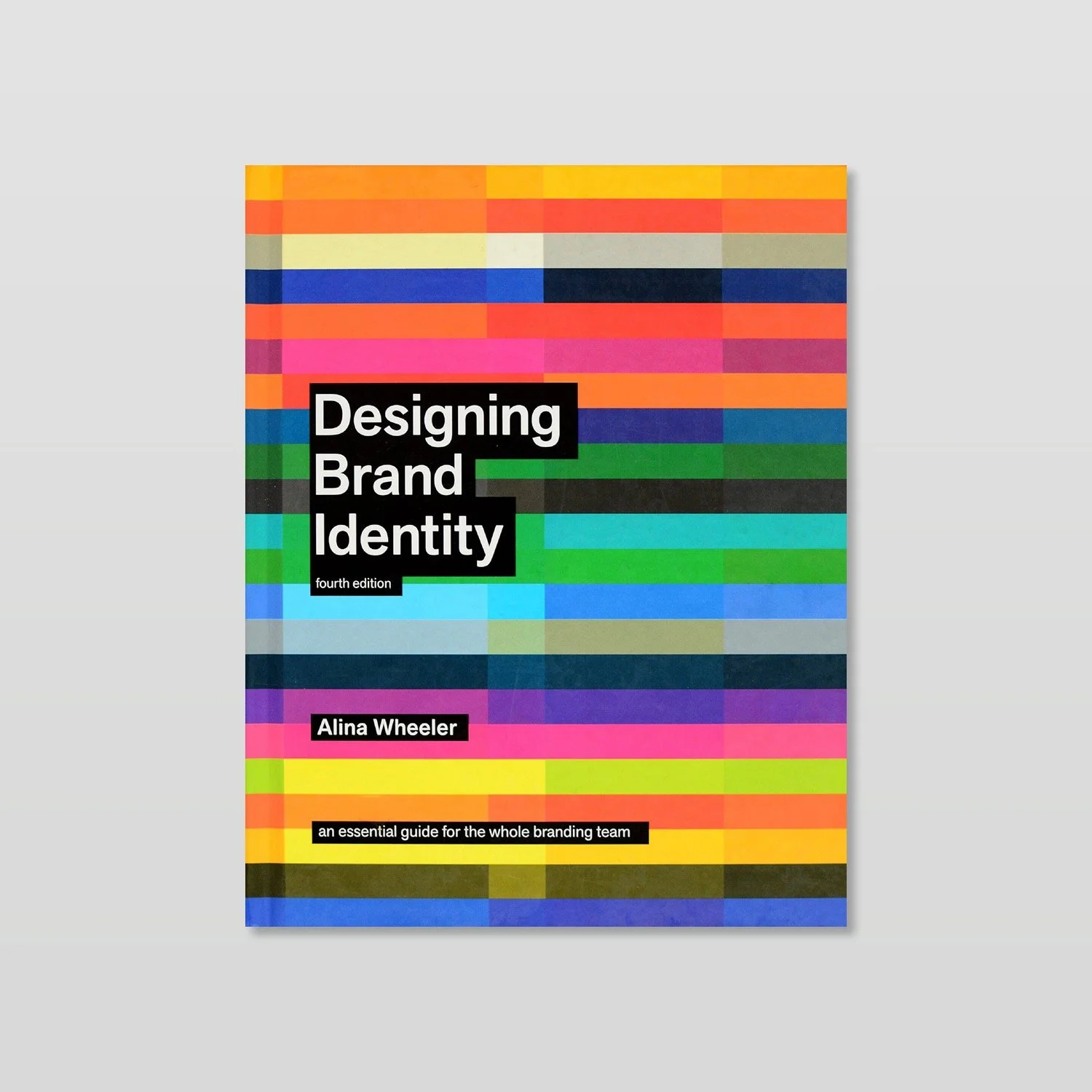
Designing and brand identity
Alina Wheeler
Chocolate sardine tin
Chocolate sardine tin
• I’m exploring how Café Jardim Luís branding can extend into product design through a limited-edition item sold only in the café. Inspired by the creative sardine tins I saw in Lisbon, I decided to design tins of chocolate presented in the same playful way. The idea of opening it like a real sardine can adds charm and makes it a fun, giftable product.
• The design uses elements from Café Jardim Luís’ branding, including a Portuguese gazebo illustration and fish and floral motifs that link back to the sardine theme. The bold reds and blues make it eye-catching while keeping it playful, stylish, and clearly connected to the café’s identity.
REFELCTION
• Really happy with how the logo turned out
• Feels memorable and eye catching without being complicated
• Wanted it to be conceptual and have meaning, not just decoration
• Links directly to the café’s story, values, and atmosphere
• Balances modern and traditional qualities
• Form and typography inspired by Portuguese design heritage
• Simple composition gives it a clean, contemporary feel
• Shows how design can communicate feeling and philosophy, not just look good
• Every choice based on the café’s tone of voice — warm, grounded, thoughtful
• Learned the value of restraint in design
• Removing unnecessary details made it stronger and more distinctive
• Logo feels confident but quiet, meaningful but understated
• Represents slow, intentional design and connection to place and culture
MENU DESIGN
Design Notes
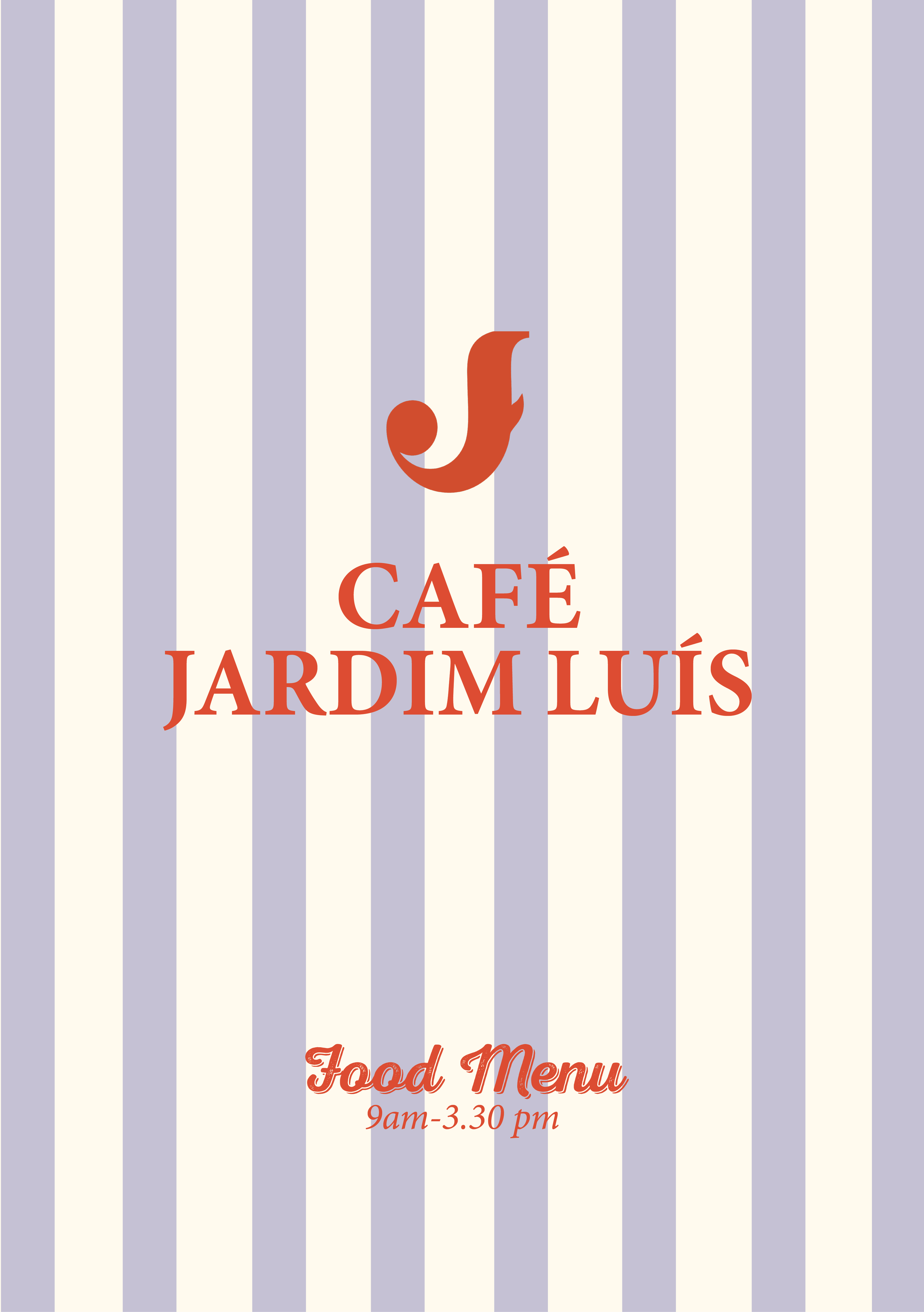
• Want it to feel clean and modern but still warm and inviting
• Professional look with a few classic touches
• Using my own simple illustrations to keep it personal
• Soft lilacs and reds for warmth
• Maybe add light textures or stripes, nothing too much
• Fonts need to be clear and stylish
• Include small bits of the logo to keep everything tied together
• Overall vibe: balanced, cohesive, relaxed but refined
FOOD IDEAS
Mix of traditional Portuguese dishes with a modern twist
• Fresh, local ingredients and affordable prices
• Clear labels for dietary options
• Inspired by Mediterranean food – light, healthy, flavourful
• Keep everything sustainable and simple
• Reflect everything I wanted for the café brand
• Menus are a key part of the café experience and first impressions
• Design helps set the tone for the food and atmosphere
• Well-designed menus build trust and show care and quality
• Early project that helped me understand brand consistency
• Menus capture the balance of modern and traditional style
• Feel cohesive with the space professional and welcoming
• Would rethink the daytime drinks menu illustration as the colours don’t match the brand as well as I’d like and would adjust artwork to better fit the overall identity
• Happy with the other menus — content feels authentic and appetising
• Good balance between aesthetics and function
• Project taught me how important design is at every customer touchpoint
REFELCTION
Illustration Development
Illustrations used to assist menus, packaging and co-branded items


Pattern design
This is something I wanted to explore more personally and thought pattern design would enhance my brand. Here is a collection of prints I made using both procreate and illustrator


• Really happy I got to use more illustration in this project
• Illustration is something I’m passionate about and love doing
• Didn’t include much illustration in my previous project
• Felt it was important to bring it into this one to show my skillset
• Explored a few different illustration styles across mediums
• All link back to Portugal and reflect the café’s story and identity
• Illustrations help add warmth, personality, and a handmade feel to the brand
REFELCTION
coffee cup designs
Design Notes
I experimented with some patterned versions using the floral motifs and logos I’ve been developing. I think these work really well because they feel so on brand, the colours, patterns and illustrations all link back to the visual identity. The minimal cup feels clean and natural, while the patterned ones bring a bit more playfulness and energy, which really fits the café’s character.
Seasonal Christmas Cup
• I’m designing a seasonal coffee cup as a special edition for the brand, something that will only be available once a year and change annually. It’s been such a fun project to work on, and it’s made me think a lot about how important it is for branding to stay flexible throughout the year. For this design, I’m creating a snowy town scene inspired by an English winter, probably London, with little details that make it feel familiar and festive. I’m also adding Portuguese touches like bicycles and vintage cars to tie it back to the brand.
REFELCTION
Explored lots of different design ideas
Some concepts didn’t work well together as a set
Important to choose one direction and stay consistent
The patterned design feels too bright and intense
The simple line drawing version fits the brand better
Cleaner, calmer, and more in line with the café’s overall style
Really happy with the Christmas cups I think the illustrative nature of the cups makes it playful, fun and unique
Packaging design
WHAT I WANT TO MAKE
I want to create packaging that you would see in a cafe:
coffee bean packaging, gift wrap, takeaway bags, bottle design, coffee cup design,
I have incorporated patterns, illustrations and clear typography.
Below is some product examples all made on indesign and illustrator
REFELCTION
•Explored lots of different packaging ideas and styles
• Probably created too many variations overall
• Realised that sometimes simple is the best approach
• Wanted to show my design skills and experiment with techniques
• Included both print and illustration to add variety
• Gave each product its own unique identity
• Designs look strong individually and feel on brand
• Might not work as effectively when shown all together
• Learned the value of consistency and restraint in packaging design
socials
Notes
Photography
• Use clear, natural light
• Show food, drinks, and parts of the interior
• Capture textures and small details
• Keep colours warm and consistent
• Make it feel relaxed and real
Logo and Branding
• Use the logo as the profile picture
• Include it subtly in posts (menu, cup, napkin, wall)
• Repeat it often so it becomes recognisable
• Keep everything simple and connected
Feed Feel and Style
• Keep the overall feed warm and calm
• Mix real café photos with creative visuals
• Show atmosphere and small everyday moments
• Maintain a consistent, familiar look
Co-brand
Gelato Lovers Club
• Idea to attract kids and families with playful design
• Features fun, cheeky characters, sticking tongues out like licking ice cream
• Seasonal concept that can be updated or rotated
• Could work well across packaging and product design
• Looks fun, eye catching, and light hearted
• Has potential for merchandise such as T shirts, stickers, or tote bags
• Adds a youthful, energetic touch to the overall brand
Shirleys Cider
• Brand is inspired by where I live
• Feels personal and connected to my surroundings
• Lots of orchards nearby influenced the theme
• Used a cute illustration style showing fields, apples, and countryside elements
• Has a warm, rural, and natural feel
• Captures a sense of place and community


