
Research areas
what is branding?
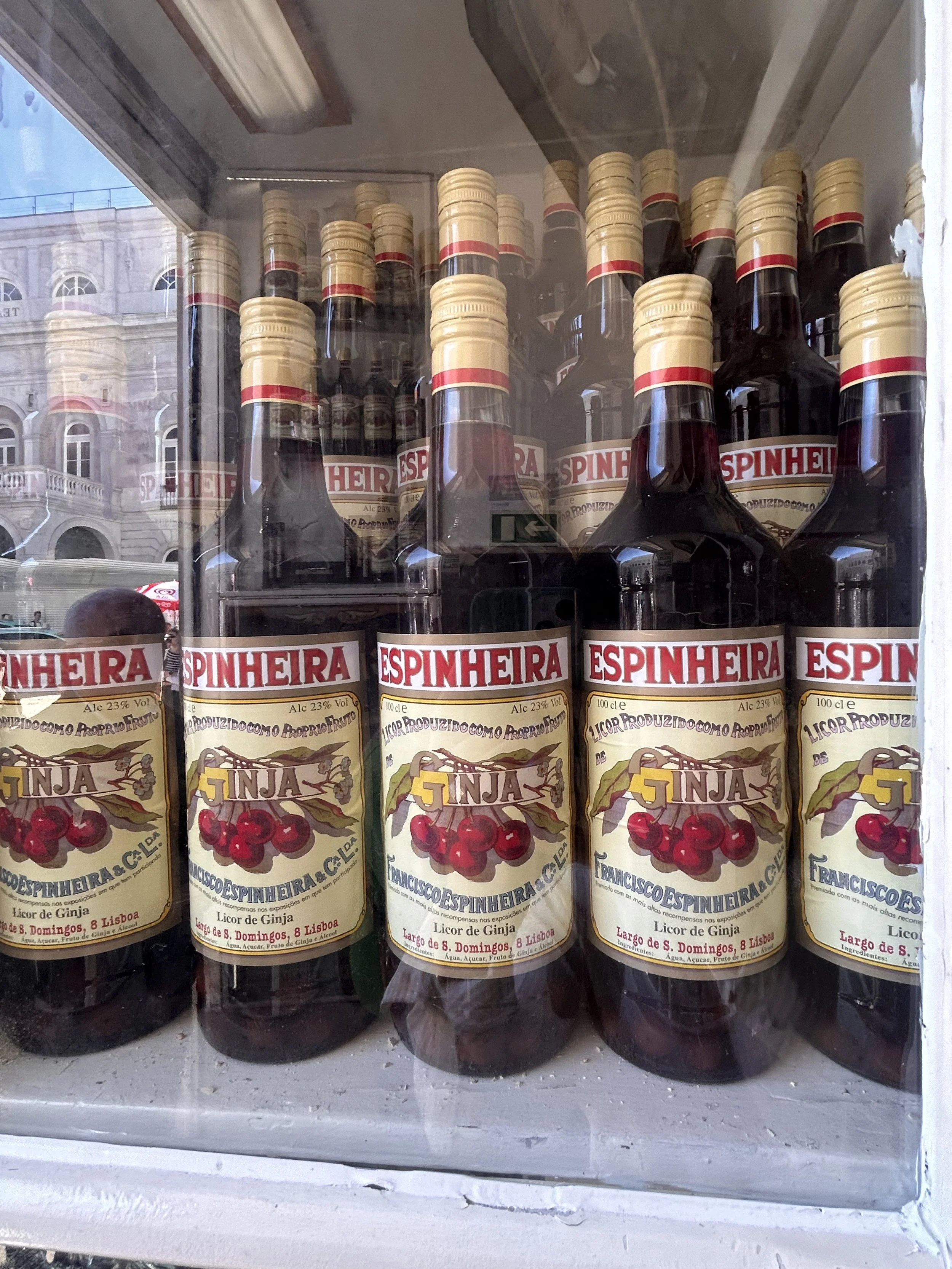
Packaging
hospitality branding
Sensory branding
Case study’s
Semiotics
Lisbon branding
Logo research
Psychology
Storytelling
Brand strategy
Community
I want to learn all I can about branding before I start creating anything. I want to know how it works, why it matters, and how it affects how people interact with a firm. This is my rough research dump, or the basic ideas that will define my project before I start writing my dissertation or designing the café brand.
What is branding?
I'm starting to understand that branding is more than simply a logo, colour scheme, font, and so on. What I read in every book and article is the same:
Branding is how people see things.
Branding is about feelings.
Branding means trust.
Branding means something
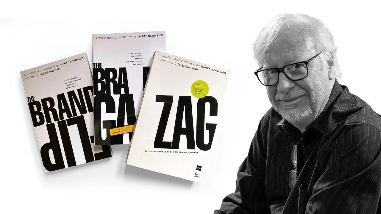
The Brand Gap
Marty Neumeier, who wrote The Brand Gap, offers a point that truly hits home for me: "A brand is what people think it is, not what the company says it is."
— Marty Neumeier
This thought already affects everything.
I can't "design" a brand by merely making it seem good; I need to change how people feel.
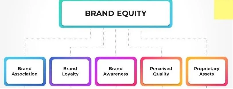
BRAND EQUITY MODEL
And then there's David Aaker and his whole idea of brand equity, which includes things like awareness, loyalty, connections, and perceived quality.
In other words, it's suggesting that strong branding means good commerce.
People purchase trust, feelings, and familiarity.
Psychology WITHIN DESIGN
I didn't think the science of perception would be this intriguing when I first started reading about it. It seems that our brains respond to pictures before we ever think about them.
People make quick judgements about a brand.
A good design makes people feel good.
Colour has an effect on the mind.
Being consistent develops trust
The quality that people think they see is affected by texture and substance
This is why packaging and interiors may make something feel more "premium" even if it isn't.
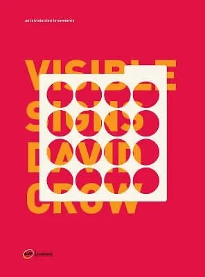
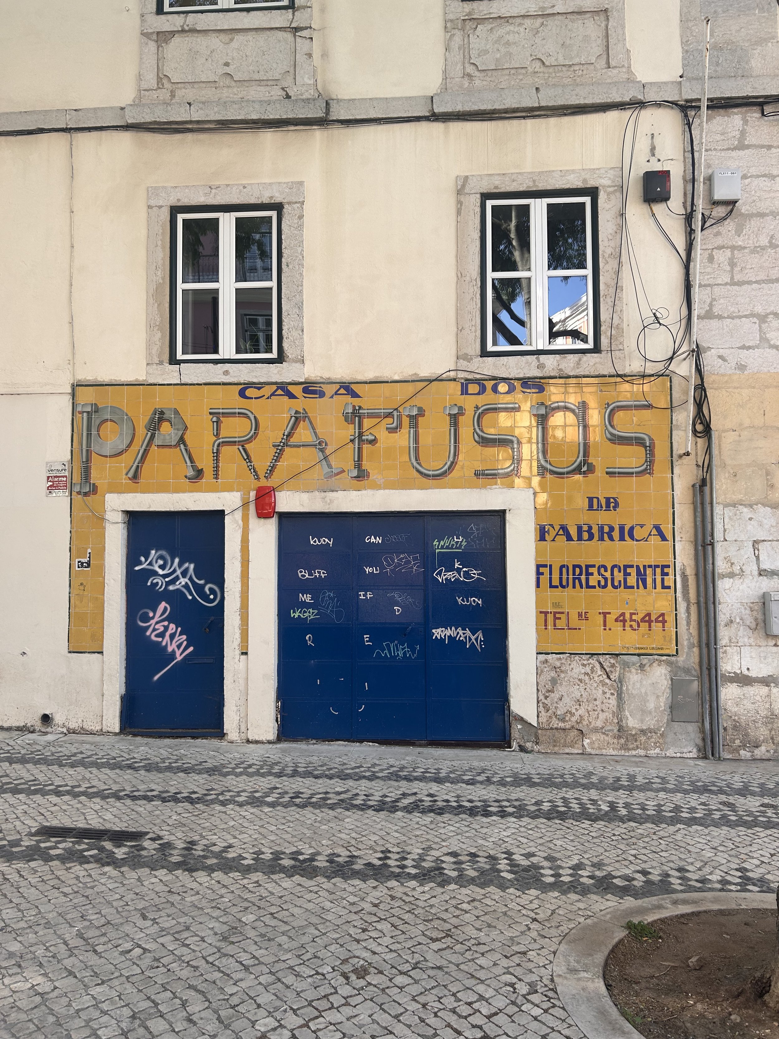
Semiotics
David Crow's Visible Signs is altering the way I perceive everything, in a very real way.
Everything communicates; nothing is "neutral."
An archway is more than simply a pretty sight; it stands for tradition, hospitality, and legacy.
A tile pattern isn't only pretty; it connects to memory, culture, and location.
A bird isn't just a random thing; it may stand for identification or belonging.
This will be a big help for my idea, especially if I'm opening a café based on Lisbon and Portugal.
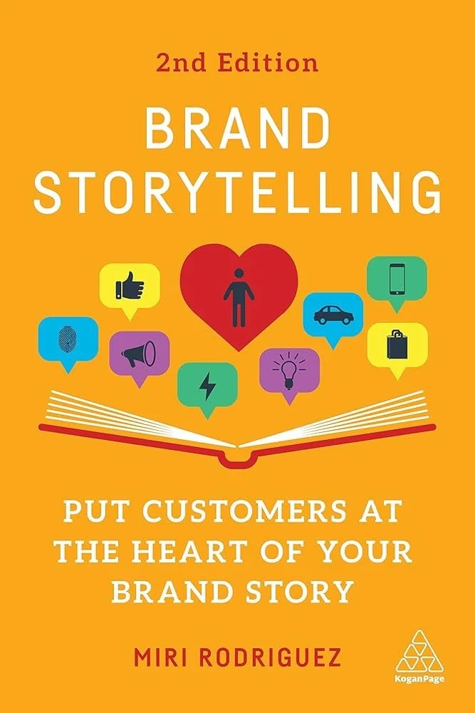
Storytelling
Reading Miri Rodriguez's work….
on narrative lets me understand why some of the best companies seem so authentic.
She says, "Stories stick because they work on an emotional level."
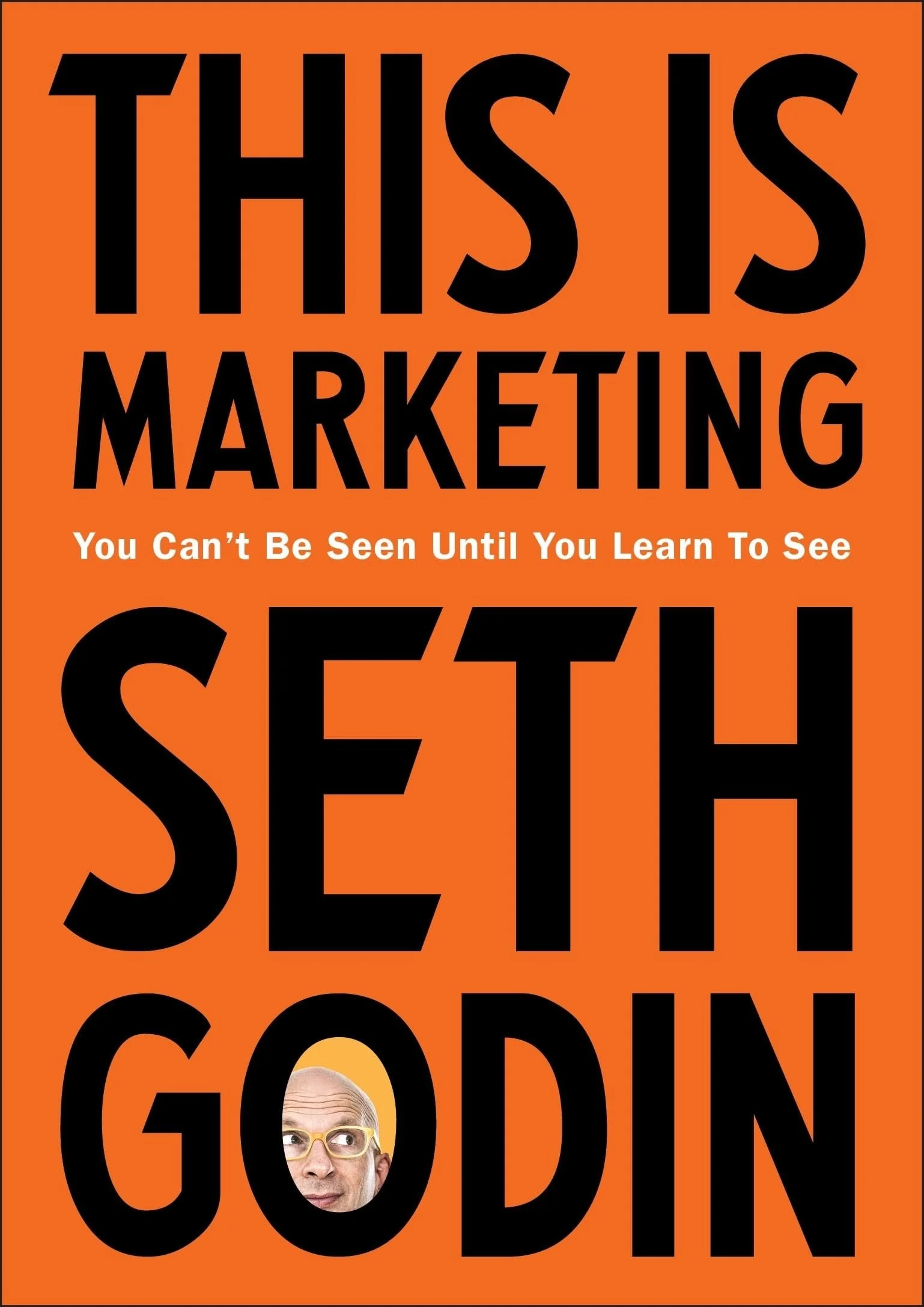
This Is Marketing, Seth Godin says….
People don't purchase features; they buy what they signify.
It needs to have emotion and a story behind it if I want to make a brand that people can relate to. Not too polished or corporate- something real.
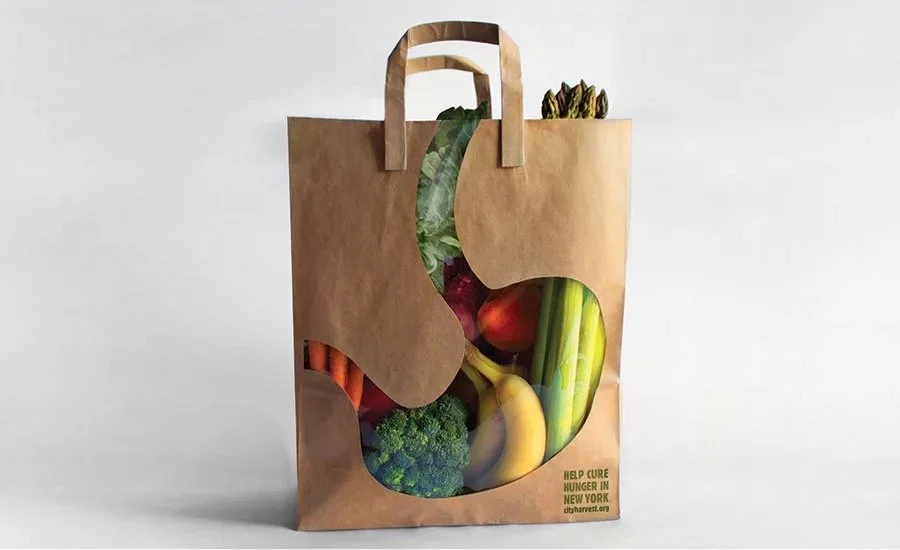
pACKAGING WITHIN STORYTELLING
“Most purchasing decisions happen at the point of purchase.”
Meaning:
Packaging = the moment of truth.
It’s not just a container — tiny storytelling surface.
Textures, materials, colours… they’re all signals.
So if I ever design packaging for this café brand (food, pastries, take-away), it needs to feel meaningful and aligned with the story.
brand case study ideas
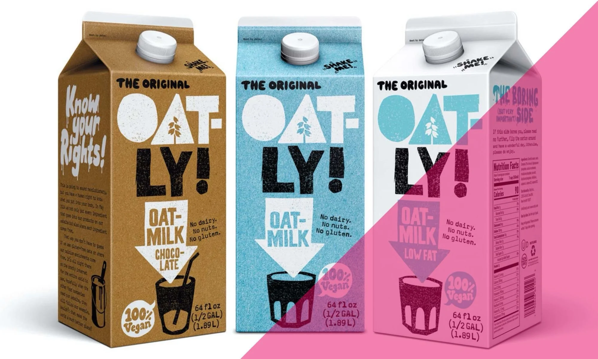
Oatly
Their tone of voice is wild. Honest, sarcastic, activist. Shows how branding can be personality-based, not corporate.
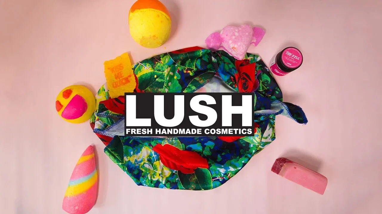
Lush
Visual consistency + ethics + playfulness. Everything they do aligns with their values. Black pots, handwritten labels, bright products.
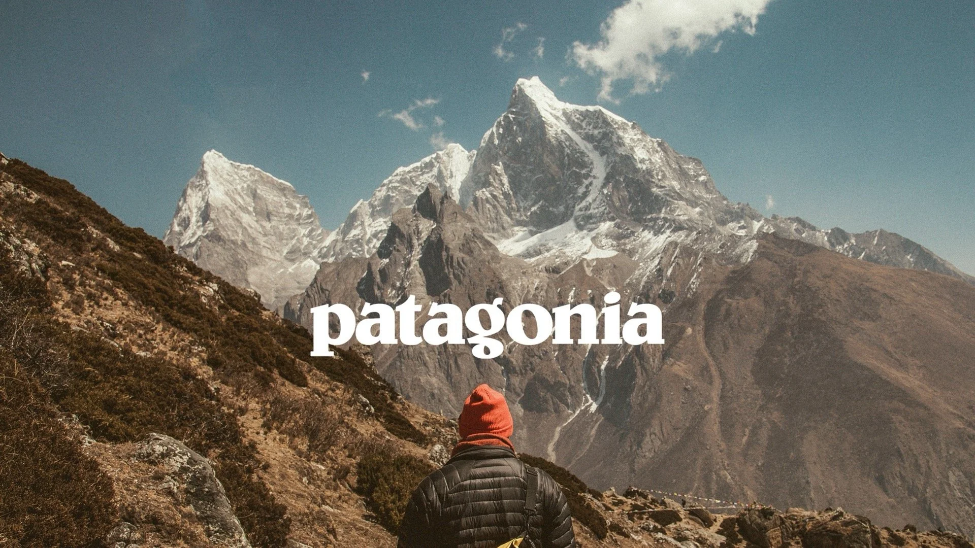
Patagonia
Purpose-driven. Activism isn’t a marketing tactic for them
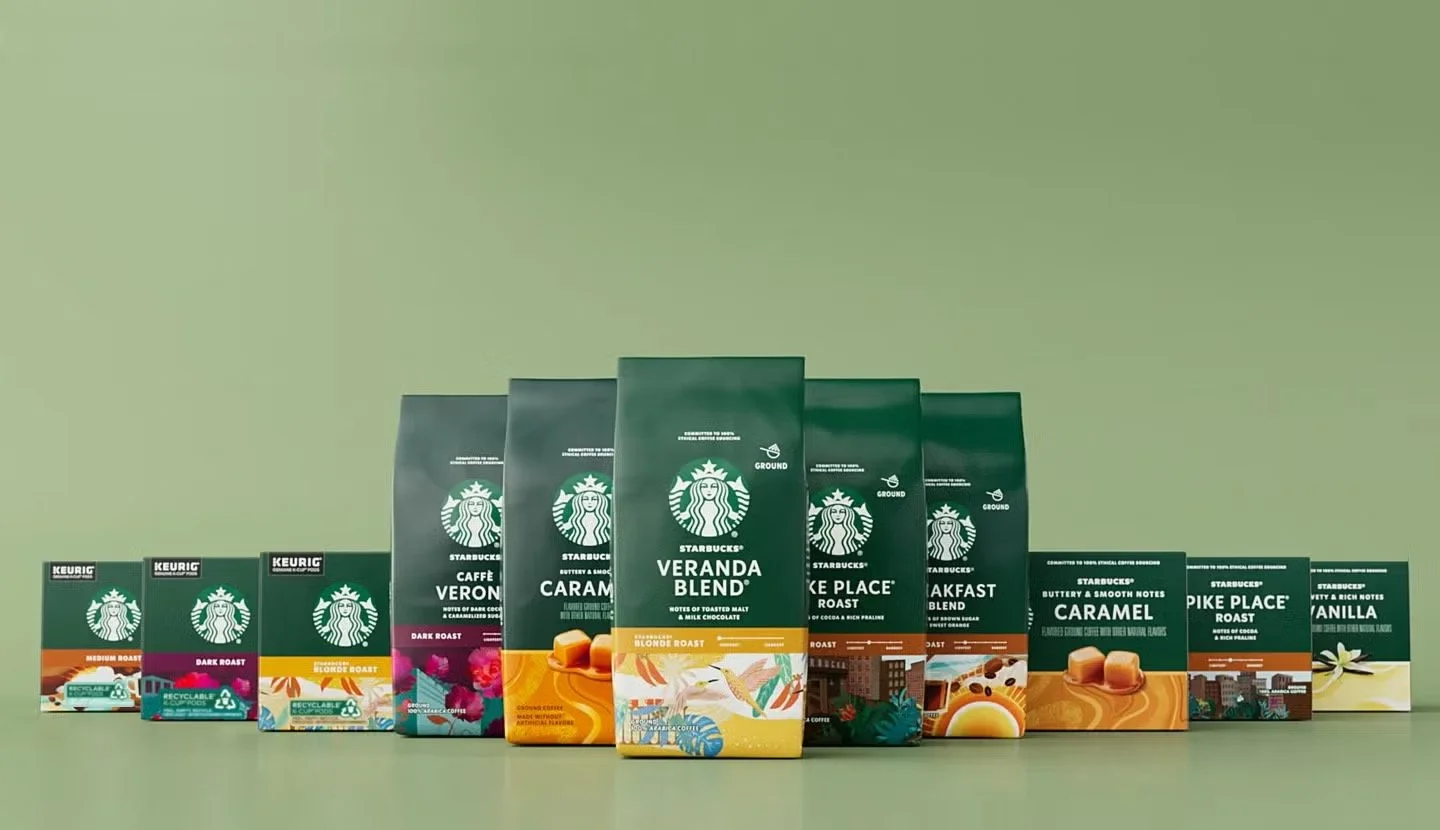
Starbucks
Interesting global example. Extremely consistent. Thoughtful use of interiors, typography, music, packaging. Clear brand universe.
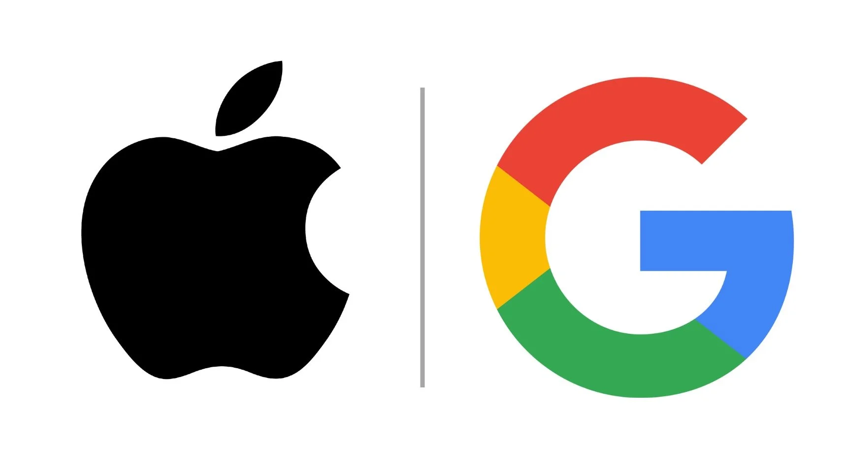
Apple + Google
Design, business advantage. Minimal, emotional, clean, global.
Seeing these side by side shows me that:
The strongest brands are consistent, emotional and culturally aware.
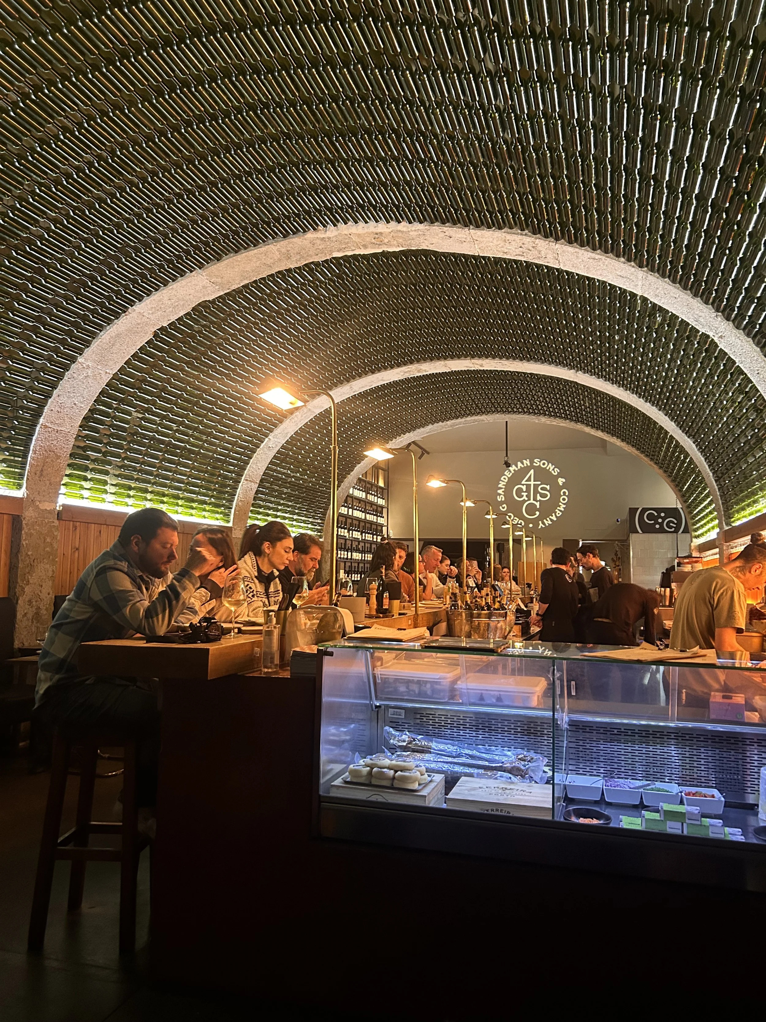
Cafés + hospitality branding
I’m looking into café brands specifically because that’s where my project is heading.
I’ve been studying:
Café Janis (Lisbon)
Beautifully curated brand experience — menu, interiors, Instagram, everything matches.
The Milkman (Lisbon)
Simple branding but so effective. Clever ideas, like ice-bear latte cubes. Shows how small touches = huge impact.
Nando’s
Cultural identity done well. Iconic cockerel. Warm colours. Playful patterns.
Gail’s
Sophisticated minimalism. Clean typography. Fresh, uncluttered, recognisable.
Joe & The Juice
Lifestyle-driven branding. Bold, urban, youthful.
These are teaching me how small interior decisions + packaging + visuals merge into a memorable experience.
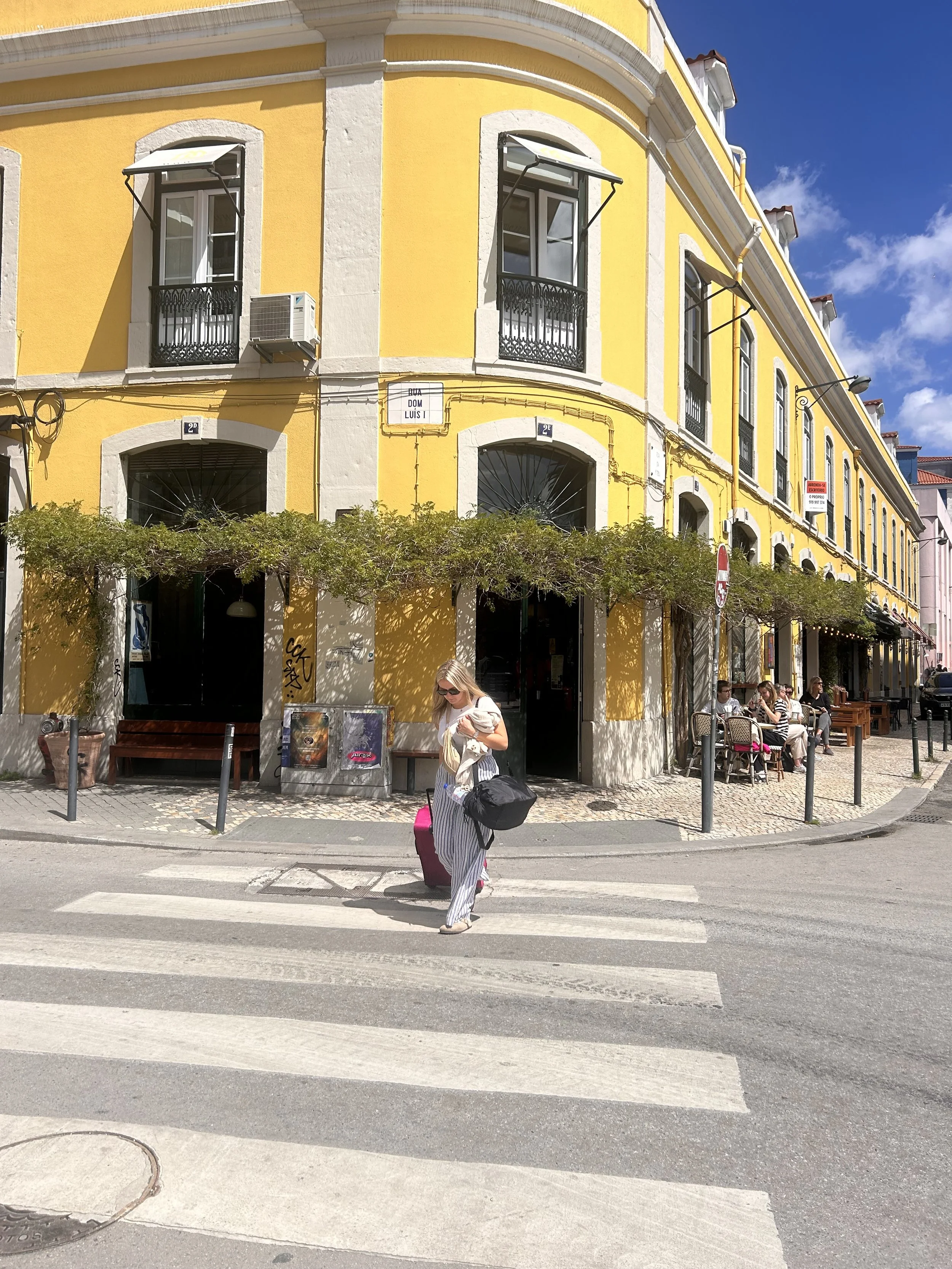
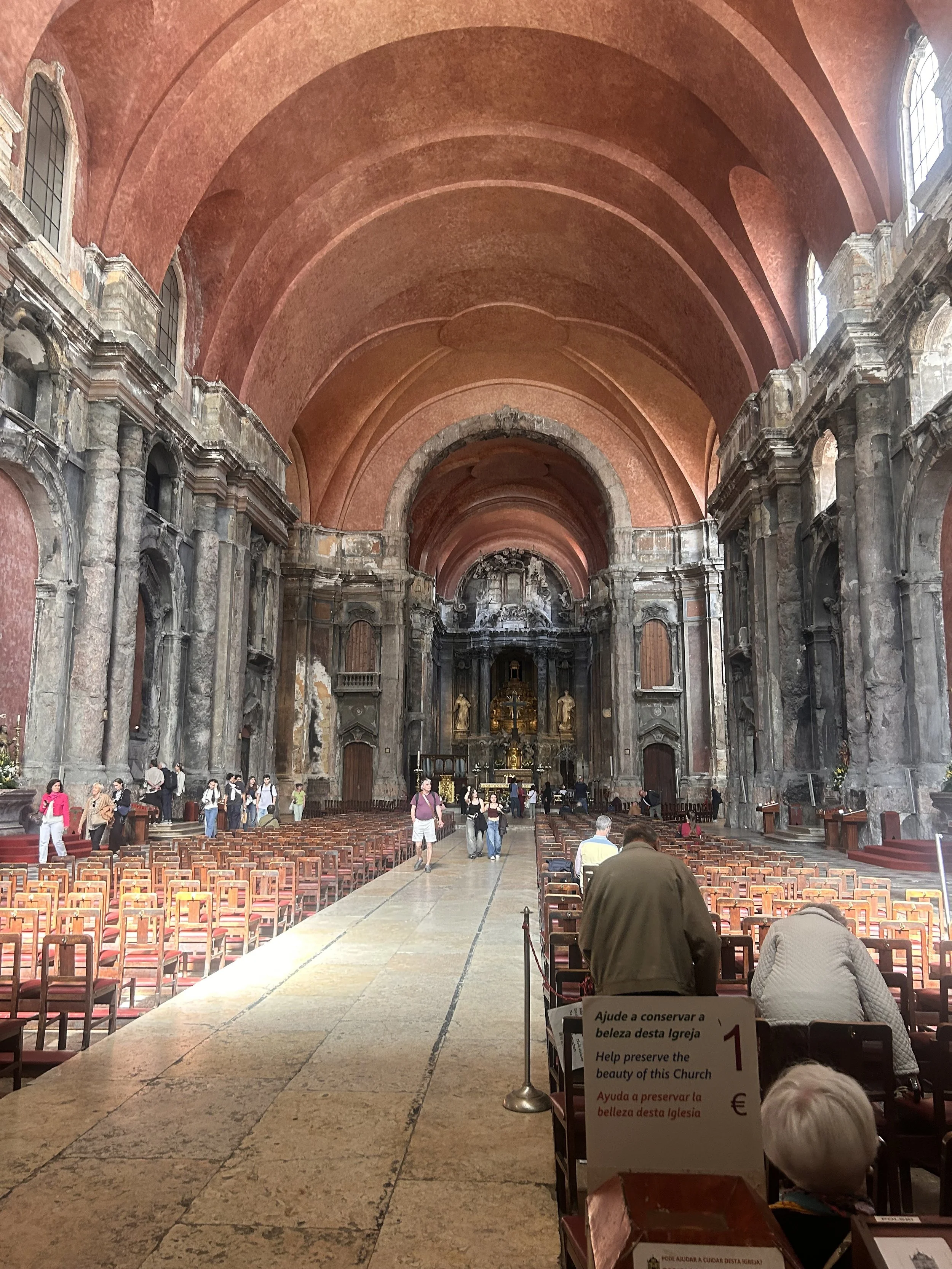
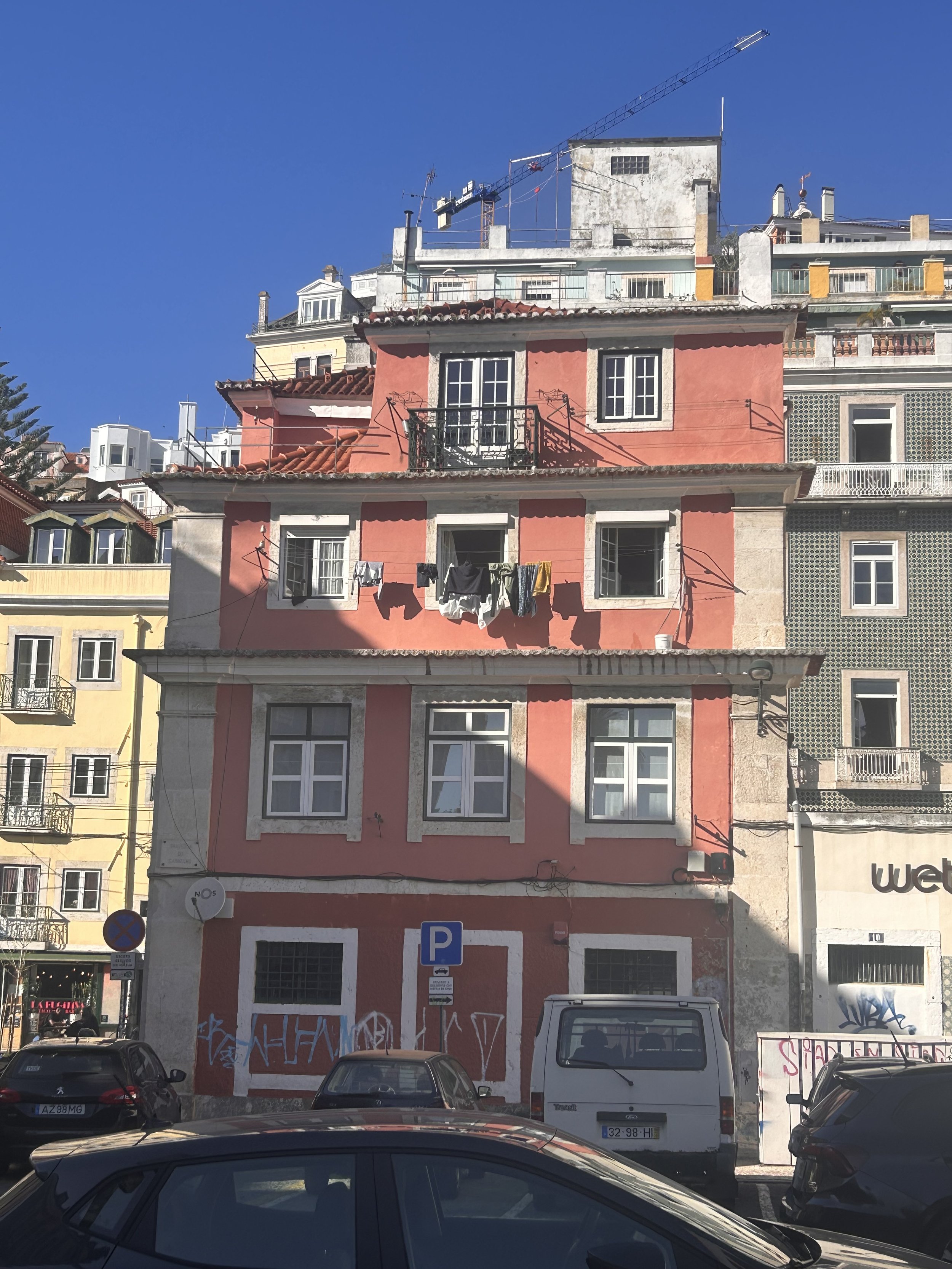
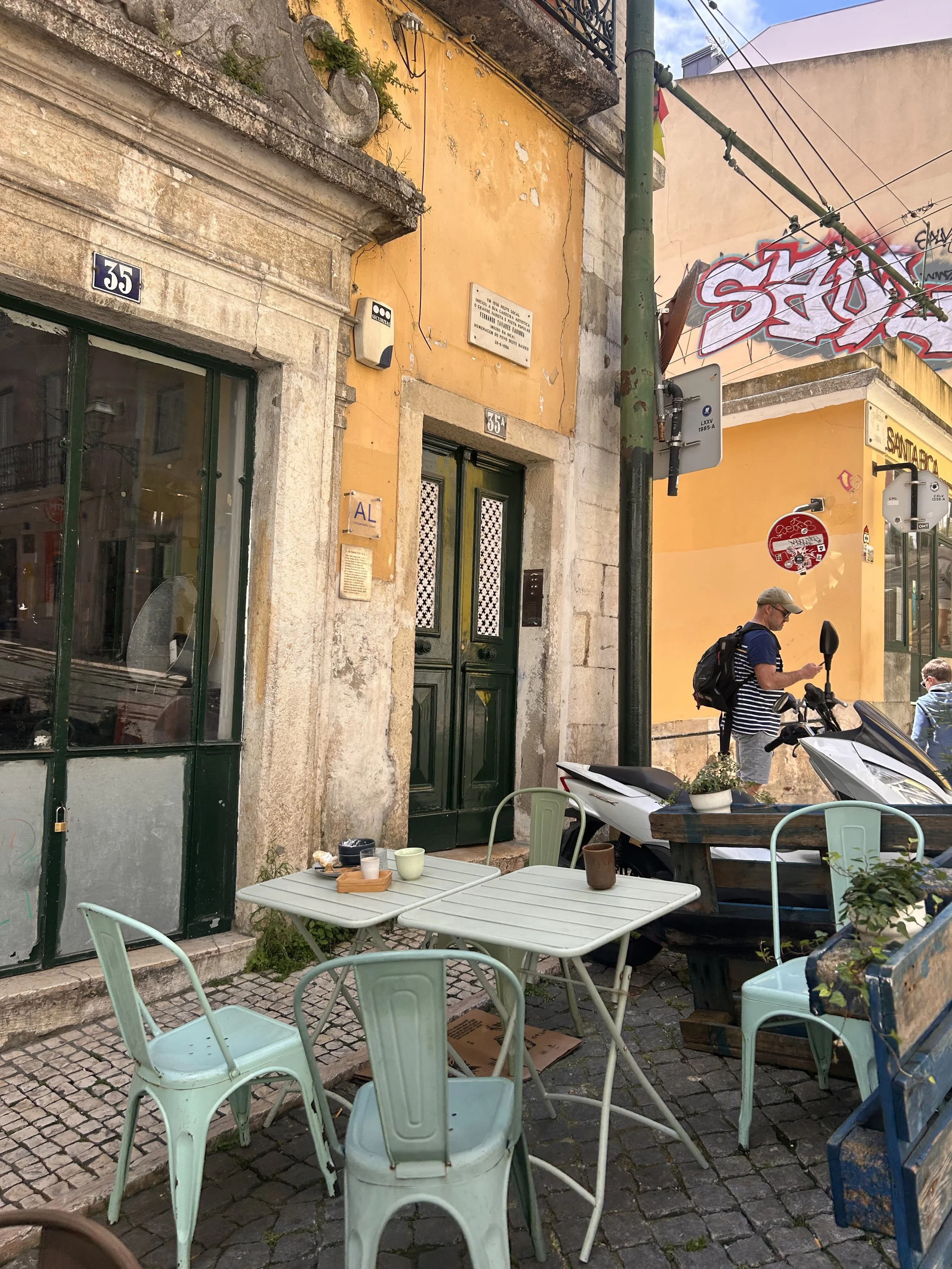
Lisbon
I believe that this will have a significant impact on the entirety of my project.
I am realising that I am pulled to Portugal because of the colours it has to offer, the cuisine, the vibrancy, and the architecture. I believe that I would want my café brand to be based on a specific location rather than on something that is more general.
The things that I have seen from the pictures and my own investigation are as follows:
terracotta reds tile blues
Illuminations through the sunlight
arches in all locations
small-sized kiosks located in gardens
vibrant coffee shops
pastries that are newly made
surroundings that emphasise the community
In the future, all of this information may be used in the creation of my identity design.
BRAND MANIFESTO/ PROPOSAL
Purpose
Bring a piece of Lisbon’s warmth + culture into everyday life
Create a calm, welcoming café where people slow down and feel at home
Values
Warmth & hospitality
Cultural authenticity (Lisbon-inspired)
Craft + quality
Community
Simplicity
Creativity (illustration-led identity)
Mission
Serve fresh, Portuguese-inspired food and drinks in a beautifully designed, story-led space
Make every visit feel like a small escape to Lisbon
Personality
Warm
Calm
Friendly
Creative
Cultural
Gentle + sunlit
Modern with traditional touches
Tone of Voice
Friendly and human
Simple and warm
Lightly poetic + sensory
Honest, descriptive, not corporate
Audience
Creatives, freelancers, young professionals
Café lovers
People who value atmosphere + design
Locals + curious travellers
Anyone who enjoys Mediterranean/Portuguese flavours
Positioning
A design-led, culturally rooted Lisbon-inspired café
Warm, slower-paced, crafted experience (not premium, not fast-casual)
Illustration-driven branding + storytelling woven through everything
Sensory branding
This surprised me: brands now consider the full sensory experience.
touch (textures, packaging, menus)
smell (coffee aroma!!)
sound (audio branding, playlists)
taste (food, pastries)
sight (visual identity)
This is going to be important for a café brand. People don’t just “see” a café they experience it.
LOGO RESEARCH
What makes a good logo?
What I’m drawn to?
LOGO PRINCIPLES
simple
versatile
scalable
meaningful
timeless
identifiable
VISUAL DIRECTION
arches
circular motifs
line illustrations animals
cultural symbols
. Great Bustard
STYLE DIRECTION
illustrative
modern but warm
culturally rooted